The Notecard component renders a content block with very specific styling designed to draw attention to important information. There are three variations of colors and icons available:
Blue with Info Icon: This Layout has a blue border and light blue background along with a matching icon to indicate "info".
Blue Color with Chat Icon: This version has the same color scheme as the version above, but with a chat icon.
Orange Color with Important Icon: This version has an orange color scheme and an "important" icon for more emphasis.
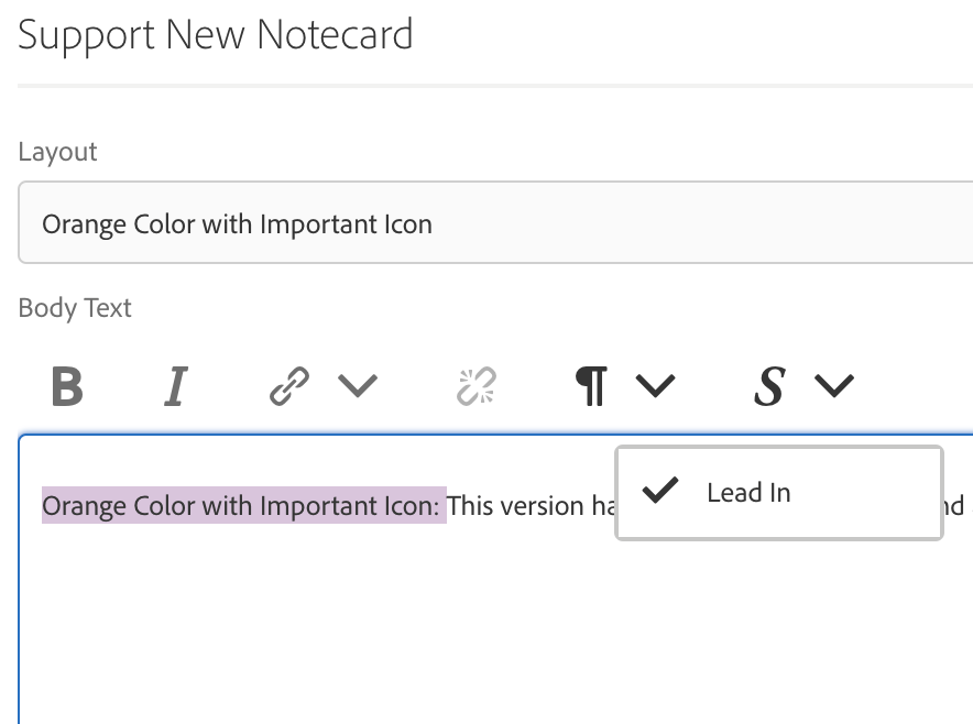
To get the bold lead-in text at the beginning of the body text, select it and click the "S" toolbar icon and select "Lead-in". This will make the text black and bold.
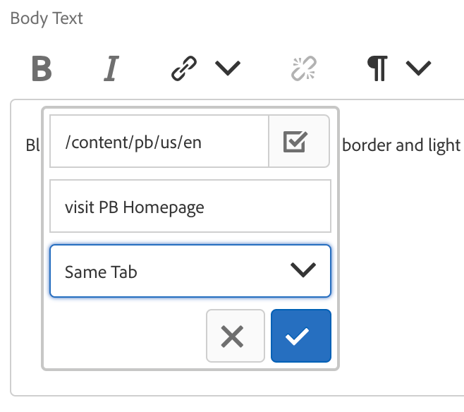
To link text within a notecard just select the text and click the link icon. Fill out the relevant fields to complete.