This component is used to bring extra attention to certain links on the site through the use of icons, bordered boxes etc.
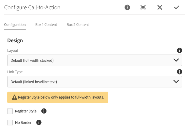
This drop-down lets you choose between one CTA that stretches the full width or two that sit side-by-side.
There are 2 options for link type:
This option displays an alternate style mainly used for Registration promotions.
This style renders the CTA without a border, making it look better when placed inside an Accordion.
Here's how a Call-to-Action renders in full width:
Here is how Side-by-side renders. Note that when choosing this option, you must fill out additional fields in the "Box 2 Content" tab to render the second box.
Call-to-Action boxes can have two different "Link Types":
For this option do not fill out Box 1 Headline Link URL or Box 1 Headline Link Title as they are ignored when rendering.
The fields in the section labeled Box 1 CTA Links (dual-cta option only) need to be filled out to create the link or links for this style. You do not need to fill out CTA 2 link information if both aren't needed.
Within the Box 1 CTA Links (dual-cta option only) section are fields related to rendering the extra links.
This option when set to Yes will open a new tab or window (the bahavior is based on the client browser settings) when the link is clicked.
This renders either a right facing carat to indicate a local link or a new window icon indicating that the link goes to another site. See examples in the CTA above.
The Register Style checkbox drastically alters the design of the Call-to-Action and should be used for promoting registration. This can also be used in the sidebar.
The No Border option is intended for situations where you need the link style and layout but without a component border. Here's an example of how that looks:
Listed below are the various Headline Icon options available.