The full width layout version of this component will not display any text from the Body Text field in the component. Instead, put a Support New Text component before or after your image.
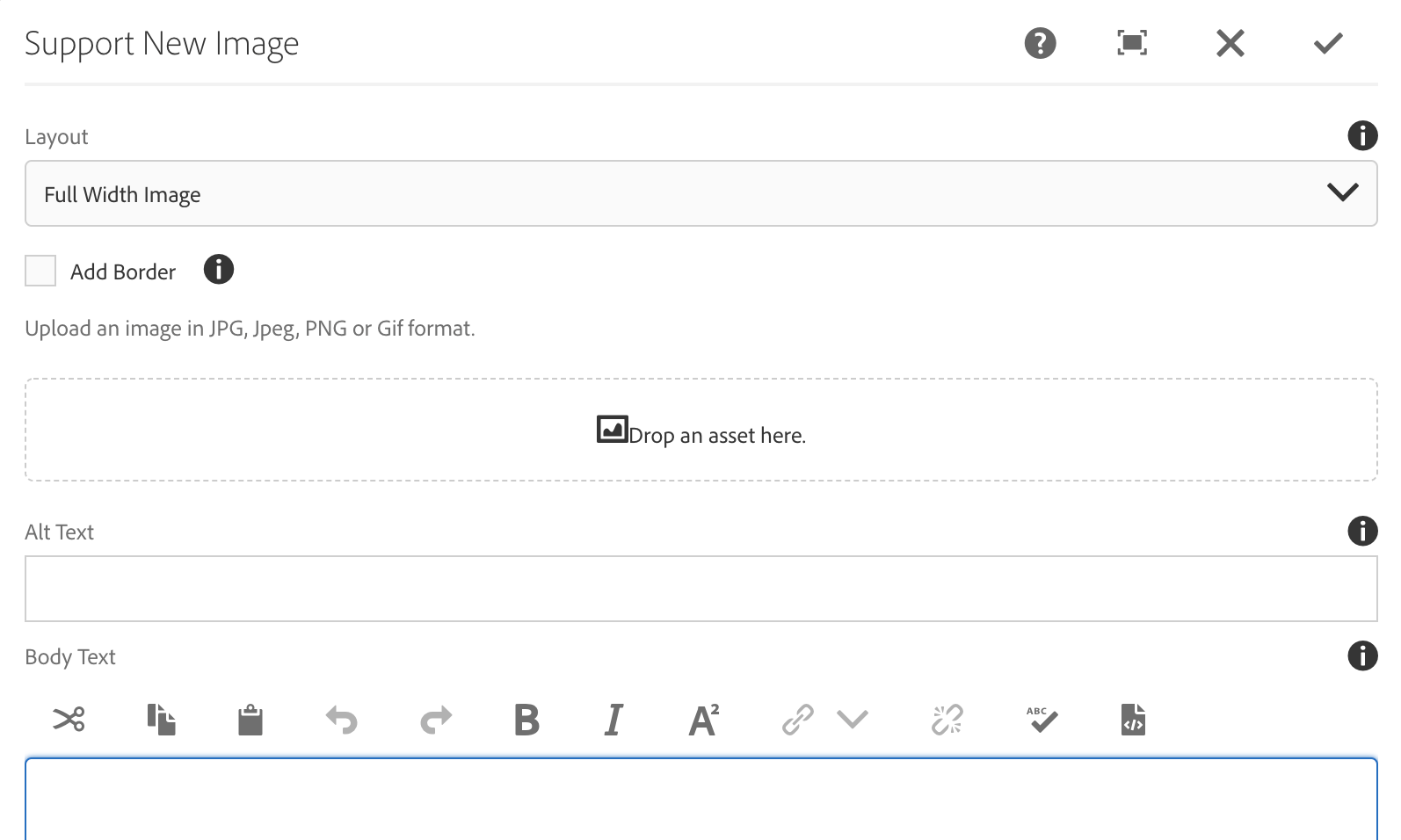
The screenshot below is making use of the Add Border feature.

This version has a Half-width image on left with content on the right. This content is displayed from the Body Text field in the Support New Image component.
This instance of Support New Image uses the "Half-width Image on Right, Content on Left" Layout setting.
To make content appear to flow cleanly around a half-width image you must intelligently choose the amount of content to place in the dialog by testing and previewing. The amount of content that will fit depends on the size and shape of image the text is sitting alongside. Add a Support New Text component after the Image component to continue the text down the page.
This is a Support New Text component that appears after the Support New Image component. This allows you to continue down the page with the appearance of floated images within the body text.