Guidelines for AEM Components
Form Components
- Select
- All
- Inline
- Overlay
- Single Page
- Sticky
- Thank You
Form Inline Component
Use the inline form when you want to integrate a form seamlessly into an existing page. This keeps the user on the page throughout the form completion process. After submission, a thank-you message appears in place of the form.
Example
Form Overlay Component
Opt for the overlay form when you want the form to appear without taking up space on the page. Clicking on the Call-to-Action (CTA) opens the form as an overlay on the current page. After submission, a thank-you message overlays, allowing users to close it and return to the original page.
ConnectRight® Mailer
Settings
Configuration
Dialog ID
- Every dialog must have a unique ID. Either provide one here or one will be generated after first save.
- We can use this ID in links and CTA prefixed by # for calling this form.
CTA
Call To Action
- Do you want a Button?
- You may have add up to Two Buttons on thank you screen.
- We can not change the CTA style/color.
Note:-
- We can add only three components to the thank you screen.
- Below are the three components:-
- Full Width Video
- Standalone Image
- Text HTL
Example
Learn more about SendPro
Form Single Page Component
With this form type, users are directed from the original page to a new form page. After submission, they are redirected to a thank-you page.

Settings
Background Image
Choose an image for the form background.
Image dimensions:- 1440px x 424px .
Call To Action
- Do you want a Button?
- You may have add up to Two Buttons on thank you screen.
- We can not change the CTA style/color.
Note:-
- We can add only three components to the thank you screen.
- Below are the three components:-
- Full Width Video
- Standalone Image
- Text HTL
Example

Sticky Form Component
The sticky form remains visible at the bottom of the page as users scroll. It serves as a container for various form types, allowing the CTA to link to an overlay, single page, or inline form.
Settings
Configuration
ID
- This UniqueID can be used for tracking hooks.
Headline
- It is required field.
- Text displayed to the left of the CTA.
CTA
Call To Action
- CTA Text
- It is required field.
- This is the label of the CTA.
- CTA Link
- We can put the destination URL as other page URL here.
- If launching an Overlay Form, this must match the #id of that component.
- Open in new Tab
- If the destination URL needs to be open in new tab of the browser then we must select Yes from the dropdown list.
- Do not enable for Overlay links.
Styles and Yes or No Action
Yes or No Action
- Disable Postal Stripe?
- To turn on/off the postal stripe at the bottom of the banner.
- To turn on/off the postal stripe at the bottom of the banner.
Styles
There are two colors for the CTA button.
- Pink
- Blue
Examples
Thank you Screens
Inline Form
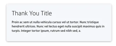
Example 1
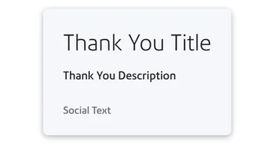
Example 2 - Show Social Text On Thank You Screen
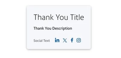
Example 3 - Show Social Icons On Thank You Screen
Overlay Form
Example 1
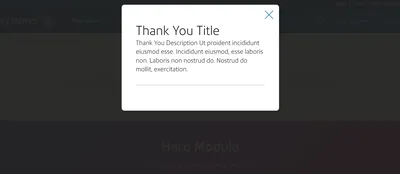
Example 3
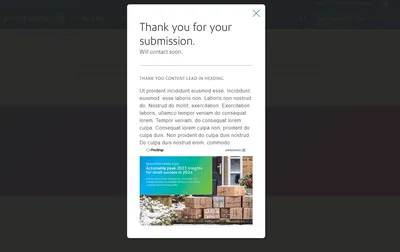
Example 4
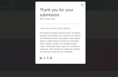
Example 5
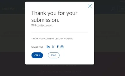
Example 6
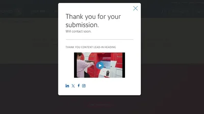
Example 7
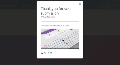
Example 8
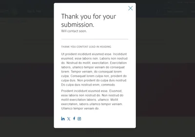
Example 9
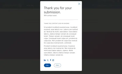
Single Page Form
Example 1
Example 2
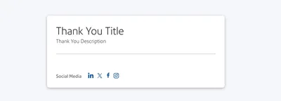
Example 3 - Show Social Option Is Checked On Thank You Screen
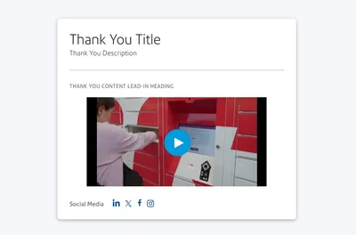
Example 4 - Full Width Video added on thank you screen
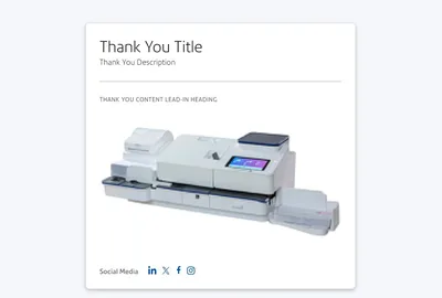
Example 5 - Standalone Image added on thank you screen.
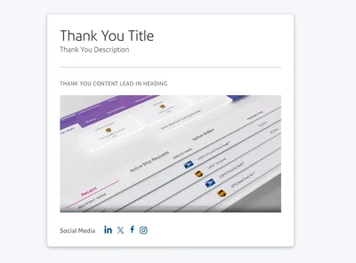
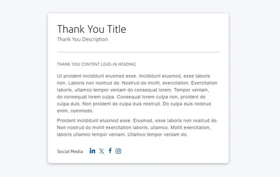
Example 6 - Texts are added on thank you screen.
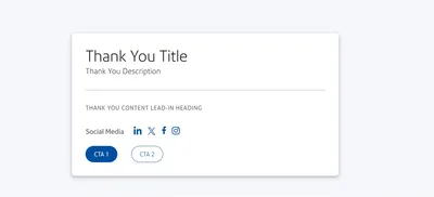
Example 7 - CTAs are added to the thank you screen.
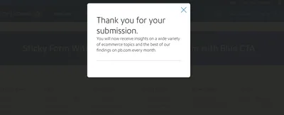
Sticky Form
Settings
Configuration
SF Form ID
This ID is given by Marketing Automation (MA) team. Which is created as per the request with the desired form fields.
Texts
Text on form page
You have two fields for the form page you can use.
- The Intro Title
- Enter a display title for the top of the form.
- The Intro Description
- Enter a short introduction that describes the form.
Text on thank you screen
You have four fields for the thank you screen you can use.
- Thank You Title.
- Displayed at the top of the Thank You page content.
- Thank You Description.
- Short supporting text for the thank you page header.
- Social Text
- It is the headline/title for the social media icons.
- LinkedIn URL Override
- Provide an optional alternate LinkedIn URL to replace the default.
- Twitter URL Override
- Provide an optional alternate Twitter URL to replace the default.
- Facebook URL Override
- Provide an optional alternate Facebook URL to replace the default.
- Instagram URL Override
- Provide an optional alternate Instagram URL to replace the default.
Button & Background Gradient
Form Submit Button
There are two types of field to add the submit button text.
- We can implement the CTA text as default which will be default for all the region/country.
- Also we can add country specific CTA text. Which will be visible to the visitor according to their location.
Please note: Never use the same button, always have a dominant CTA.
Background Gradient
Choose an Gradient for the form background.
Below are the Gradient options available:-
- None
- Light Blue
- Light Gray
- Gray
- Blue
- Violet-Orange
- Blue-Cyan
- Cyan-Pink
- Blue-Green
Yes or No Action
- Top Gap?
- This adds a gap to the top of the component separating it from the top of the page or a prior component.
- No Gap?
- This removes the bottom margin separating modules.
- Show Social?
- Check to enable social media icons on thank you screen.
- New Tab?
- If this was checked at the time of implementation, The target URL will opened in new tab while clicking.
Note:-
- To show social media icons on thank you screen we must add social media URL for LinkedIn, Twitter, Facebook and Instagram.
- The thank you message and pages may vary based on the form type used.
